Many of us are now in the business of data. It seems that not a single day goes by when we aren’t buried deep in a spreadsheet. We will ask our business analysts for a report on this or that. Occasionally, we will ask for a new column or two. And more often than not, we find ourselves exporting those reports to our favorite spreadsheet software to manipulate the data to get what we really want. But rarely do we ask ourselves, “Hey, maybe I should have the data already formatted to what I actually want out of it.”
This mindset of asking “what do I want to achieve” can be a difficult transition, especially in facility management. Many can be overwhelmed with data without the proper tools to interpret it. Presenting that data in an effective visual format can bring about highly informed decision making from the boots on the ground all the way up to the president of an organization. This is where an informatics team dedicated to providing these visualizations can bring real results.
The phrase “a picture is worth a thousand words” is somewhat selling it short. The right visualization can be worth hundreds of thousands of numbers too. The use of a simple graph can identify where you’re at, where you’ve been, and where you’re going. There are limitless ways to show data; however, finding the path to the right visualization is not always easy.

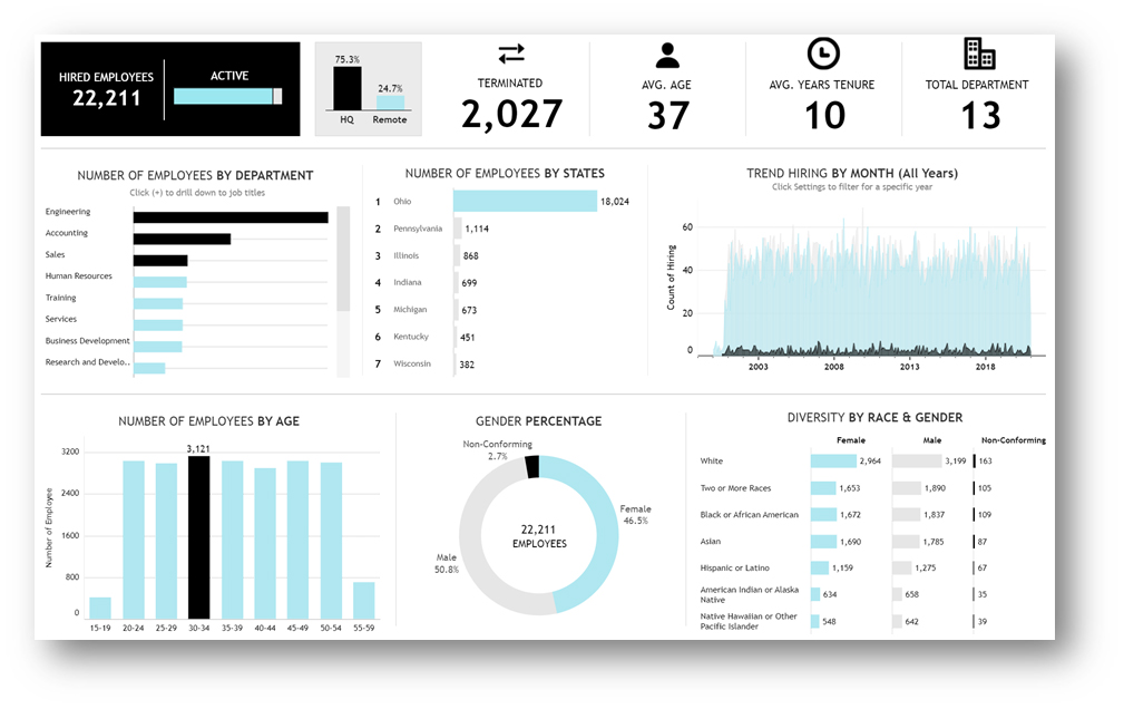
Figure 1. Modern Dashboard (HR Dashboard, published on Tableau Public; photo credit Jacob Olson, Univ. of Nebraska Lincoln)

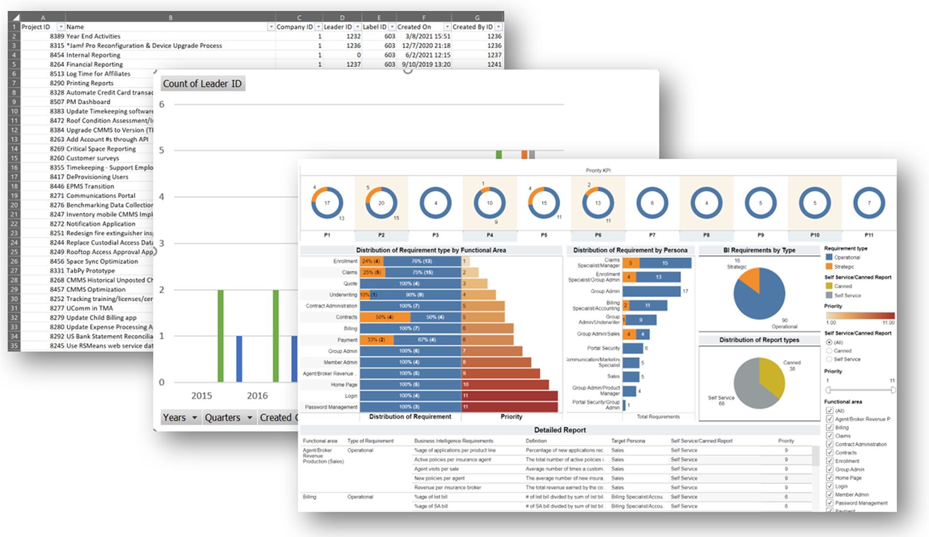
Figure 2. Evolution of Data Visualization (Photo credit Jacob Olson, Univ. of Nebraska Lincoln)
The new paradigm that will help us to get on that path begins with the informatics team asking the right questions. Instead of asking a department leader, “What reports do you need?” the question is reformatted to “What are your goals?” or “What are you trying to achieve?” This allows the informatics team to process the needs of the customer and develop the visual graphics that will help achieve that goal. This process of simply restating the question will also gradually bring those stakeholders to rethink how the informatics team can take big data and turn it into actionable knowledge.
One of the greatest successes for any informatics team is for their dashboards or visualizations to be integrated and used as part of their customers’ daily activity. Even the greatest-looking graph can be considered a lost opportunity if nobody uses it. The process of developing a useful visualization has a greater chance of success if peer review is integrated into every project. That peer review should be done within the informatics team, but also with the customer(s), and potentially with peers outside one’s organization. One can expect several iterations before a final product is complete.
One common example, which we are now all begrudgingly familiar with in this pandemic era, is COVID-19 dashboards. As the months dragged on, many of these dashboards went through several iterations, starting with simple case counts and testing graphs and eventually transitioning to include vaccinations and maps to maintain relevance.
Another element to success for any visualization effort is in the deployment. A big challenge for many is how to deploy these visualizations and dashboards to several users at all levels of an organization. Users seek customized dashboards at their fingertips without the need to dig through masses of reports. The method of deployment largely depends on the customer and the technology they will be using to retrieve their knowledge. Maintaining consistency of the platform is sometimes impossible, and it may push the decision to rely solely on a web interface available to all platforms. The plethora of data visualization tools available are highly customizable and provide a variety of means to deploy information. The local informatics team must identify the deployment method early in the process, as it can significantly drive the design of the data visualizations.
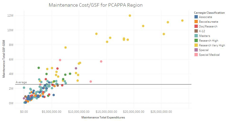
One final recommendation for new informatics teams is not to shy away from experimentation. There are many resources available for visualizations. For instance, the APPA Facilities Performance Indicators (FPI) is using Tableau to create visualizations (such as the one shown as Figure 3) to help communicate the state of educational facilities across North America. Such tools can help bring together datasets that may not normally be brought together, providing entirely new insights.
The joys of getting that perfect pivot table are not gone, but the next generation of graphical visualizations are here. They are getting easier to attain, yet at the same time they are becoming much more complex. We are continually asked to do more with less, or at least more with the same, and harnessing the power of data visualizations can help get us there. The transition from spreadsheets to all-encompassing dashboards is not easy, straightforward, or direct, and it will not be without trial and error. So don’t be afraid to take a step back when you are staring at data that looks like a spreadsheet and to ask yourselves, “Is this what we really need?”

Figure 3. APPA FPI Data Visualization (Photo credit Christina Hills, APPA)
Jacob Olson is senior manager, informatics at the University of Nebraska Lincoln and can be reached at [email protected]. This is his first article for Facilities Manager. Erik Backus is director, construction engineering management at Clarkson University in Potsdam, NY, and can be reached at [email protected].
Code Talkers
Code Talkers: Highlights the various codes, laws, and standards specific to educational facilities and explains the compliance issues and implications of enforcing these measures. To contribute, contact Kevin Willmann, FM Column Editor.
See all Code Talkers.


