Color and the feelings it evokes have long played an integral role in designing innovative and engaging spaces. The strategic use and placement of warm and cool tones, coupled with complementary patterns and textures, creates opportunities to silently promote messages or elicit a certain emotion. Architecture and design firms are continuing to peel back the basic layers of color theory to understand the psychological implications different shades and hues can have on our thoughts and feelings.
The colors found in our natural environments influence our daily lives and emotions more than we may realize. Not only does color contribute to our physical surroundings at home, in the workplace, and beyond, but it also naturally pervades our internal space, causing us each to feel and act differently based on our personal perceptions. Every hue has a psychological value attached to it, so clever, color-based design choices can impact a person’s work ethic or mood just as much as they can suggest something essential about their personality.
Given that our brains associate certain feelings and emotions with particular colors, architects and designers have the creative ability to strategically integrate various tones and patterns throughout the built environment to directly benefit and improve the human experience. Through purposeful design decisions, companies have the power to evoke an intended emotion just by having us walk by or through a space—just imagine the impact color can have on someone when they are using that space on a regular basis. Facilities Manager sat down with experts from two different architecture and design firms to discuss color’s considerable impact on all aspects of the built environment. See below for their insights!
Julie Braam, MHTN Architects
The intentional use of color in the built environment has great call-to-action potential. Strategically inserting color onto various internal and external surface types can promote movement, drawing people toward or into a specific space. From floors to ceilings and walls to beams, color not only grounds a space, but sets an intention of how that space should be used. Color’s ability to communicate and convey different messaging is powerful, and understanding the psychological impact color can have within a space is crucial to contemporary and human-centric design.
For example, warm and highly saturated red, orange, and yellow hues can summon a sense of action and urgency. These colors are beneficial in spaces where the goal is to inspire engagement and collaboration, such as K–12 and higher education environments. However, be careful not to overuse these shades, as they may yield feelings of being overwhelmed and anxious, particularly for hypersensitive, neurodivergent building users. In contrast, cooler hues of blue and green create a sense of calm and contemplation. This color palette is perfect for use in areas designed for respite and rejuvenation, such as nap rooms, lounges, or even office break rooms, depending on the context of the building’s use.
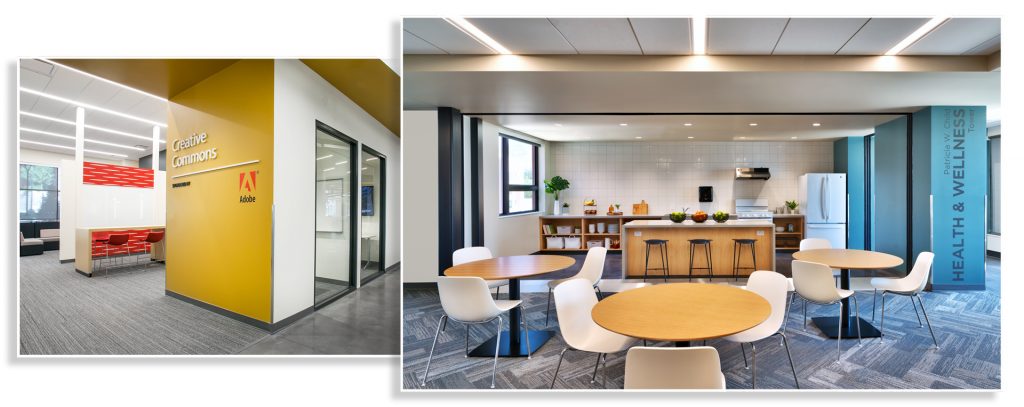
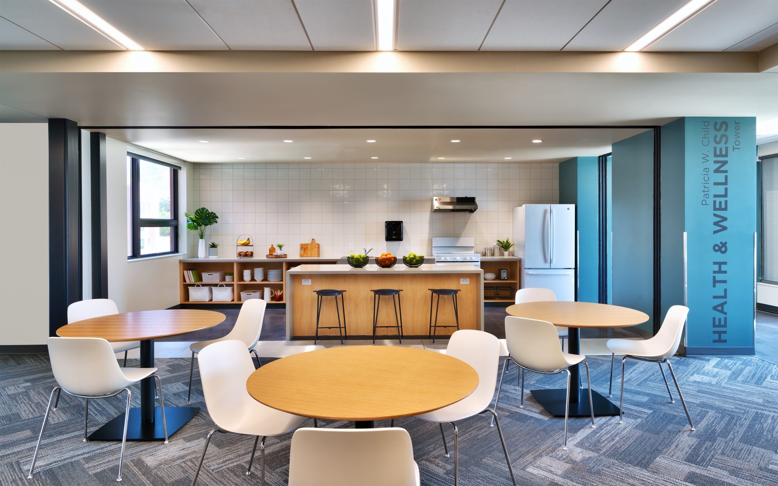
Both day and night, students at the University of Utah have access to the amenities within Kahlert Village, a new student housing building completed by MHTN Architects. The interior features work zones replete with invigorating tones, such as the Adobe Knowledge Commons (left), and a common space (right) that features kitchen appliances and access to stunning views and abundant natural light. (Photo Credit: MHTN Architects)
In addition to standard ROYGBIV (red, orange, yellow, green, blue, indigo, and violet) colors, wood and other natural patterns and tones serve another important function in architecture and design. When we say the natural environment continues to play an integral role in the evolution of humankind, we mean that quite literally. Raw, natural materials from a building’s surrounding environment are sourced daily and integrated into a project’s interior palette. This action feeds into humans’ innate desire to be connected to nature and place, more commonly referred to as “biophilia.” Wood is great at creating a sense of warmth and comfort, eliciting those feelings of “home” we establish in many of our student housing projects. The richness of darker hardwoods such as walnut and cherry adds sophistication to a space that can communicate professionalism and refinement, whereas the use of lighter, soft-grained woods such as Baltic birch and ash evokes casual playfulness suitable to many education environments. Don’t be afraid to thoughtfully blend a variety of different wood species in a space to create a balanced and engaging atmosphere!
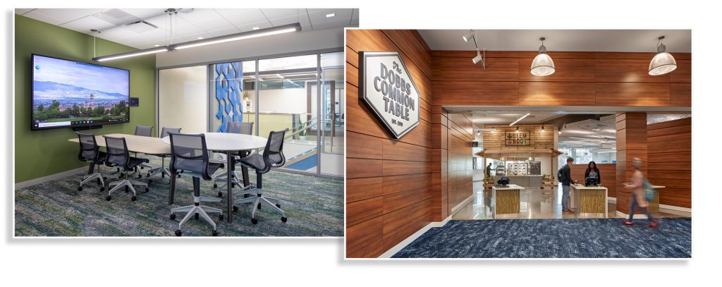
In a new collaboration with Utah State University, MHTN infused calming organic green and blue hues, as well as blue acoustic paneling, into the working IT Services Building (left). Similarly, the design team opted for darker, warmer wood tones to create a relaxing environment for students to wind down and have a respite from classes at Emory University’s Emory Student Center. (Photo Credit: MHTN Architects)
Incorporation of natural materials such as moss and wool felt are also becoming common in the built environment due to their inherent acoustic properties and their reduced impact on indoor environmental air quality. When located away from high-touch or high-traffic areas, these materials can create a stimulating but soothing backdrop to a space, as they recreate the natural subtle variation in color that we are accustomed to in nature.
John Campbell, FCA
The use of color is an important aspect of the successful design of a workplace. It is steeped in emotional and cultural references that influence people’s thoughts, feelings, personalities, and behaviors. Color has multiple meanings and emotional associations for different individuals, which adds to the richness and individual interpretation it offers in the physical environment. It remains an important element in establishing our sense of belonging to a place.
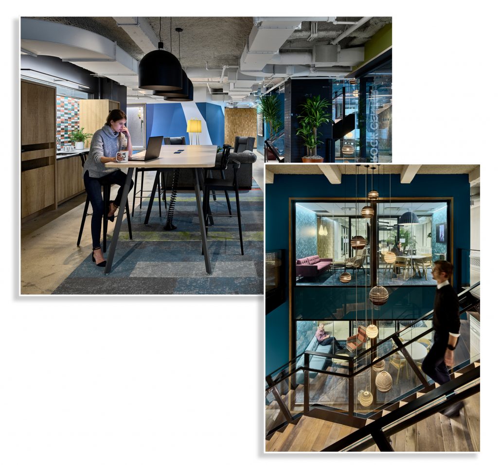
While working with EisnerAmper to develop the company’s New York City headquarters, FCA carefully curated a selection of biophilic elements, which include plants throughout the space and pops of colors, finishes, and textures to create a professional yet fun and edgy workspace. (Photo Credit: Frank Oudeman)
An organization’s brand is a reflection of its culture and values as well as its perception in the marketplace. The use of color is an essential consideration in determining how a company expresses its brand across multiple channels, including their physical workplace. It is used to build connection to its employees; how this is achieved varies depending on the individual brand strategy. Some companies use the brand color as a major feature and expression throughout their workplace, and others take a more subdued and subtle approach to the integration of their brand color(s).
Between COVID-19 and other major world events, the past two years have been a time of substantial change and stress. We have seen the transformation of how and where we conduct work, given that the vast majority desires to keep the hybrid work model in place. As such, the office paradigm has been reset around this concept of “choice.” While the need for providing a variety of spaces for focused work remains, there is a major shift toward a greater proportion of collaboration, social, and learning spaces. This significantly changes the spatial and furniture dynamics, enabling a richer visual experience. To cater to all types of employees and individual work styles, the workplace needs to strike a balance between creating excitement and energy, while also prioritizing a sense of wellness, peace, and calm.
With greater emphasis being placed on the health benefits of biophilia and sustainability, many workplaces are incorporating natural or recycled materials as a major design element. These materials have their own characteristic colors and provide the background and base color from which to create a holistic color palette. The new workplace, built around “choice” with a variety of work and furniture settings, has created new opportunities to use color and texture to emphasize different settings and accommodate neurodiversity.
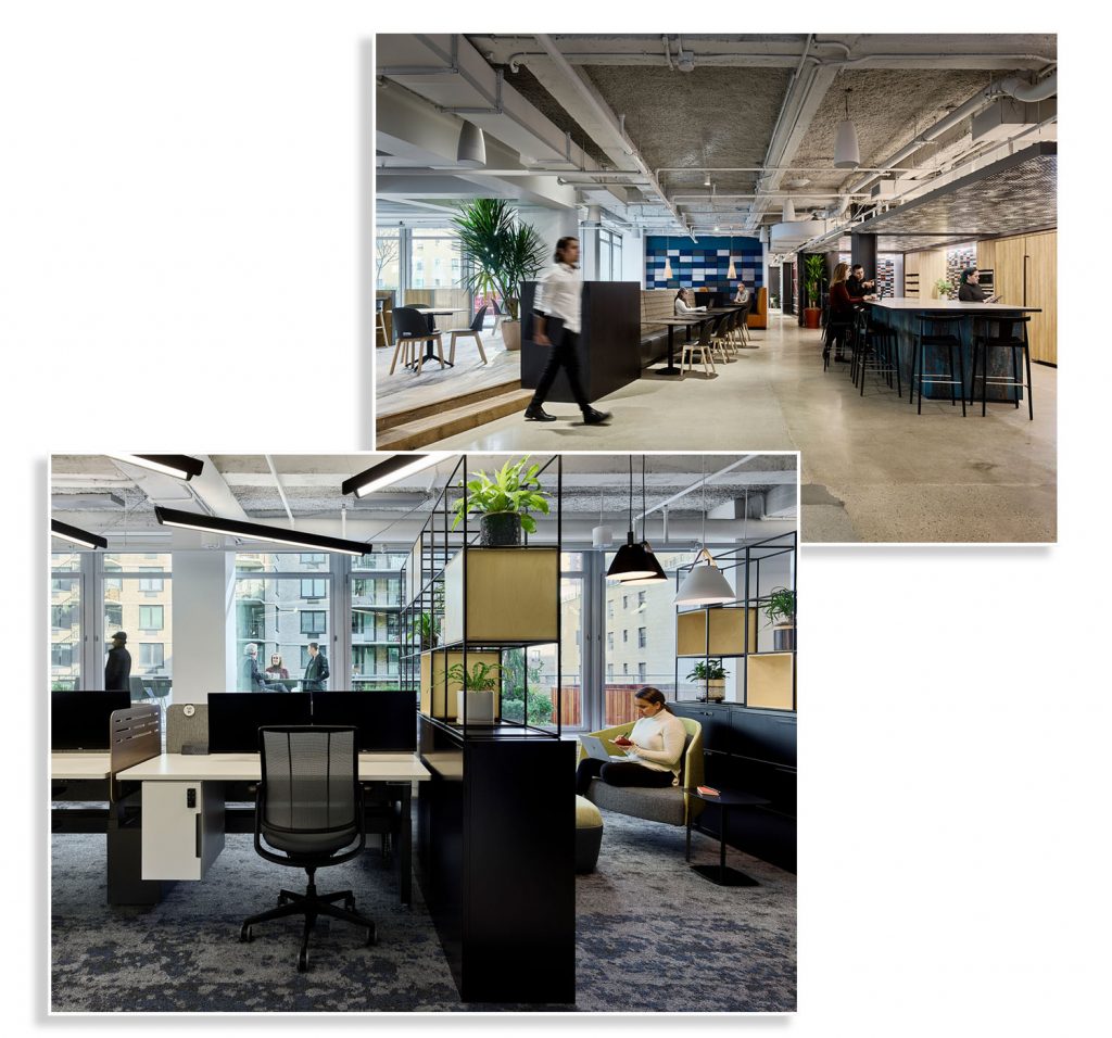
Further supporting the well-being and comfort of EisnerAmper’s employees, FCA created more intimate workstation neighborhoods that can be reserved each day through the company’s smartphone app, and ensured that the layout of each floor provided everyone with access to natural daylight throughout the space. (Photo Credit: Frank Oudeman)
There is significant research regarding the psychological impact of color in space. In general, colors moving toward cool are used in spaces that aim to create a feeling of calmness, while colors moving toward full saturation are known to be energizing. We are in a period when trends are moving toward cooler and more calming colors and are being contrasted with elements of stronger, brighter, and saturated colors.
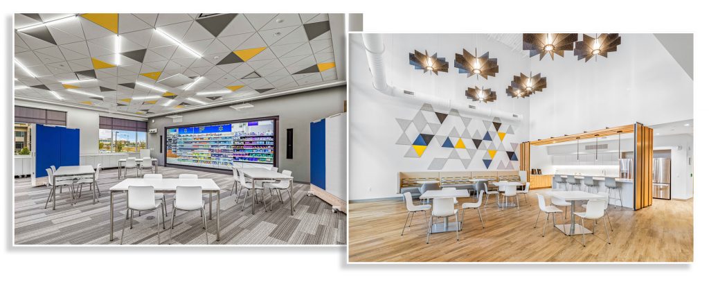
In FCA’s latest collaboration with consumer healthcare company GSK, the design team incorporated cool gray tones and bright pops of color to create a calm yet energizing atmosphere for occupants. GSK also worked with FCA to incorporate subtle, yet thoughtful nods to one of its largest accounts, Walmart, through the use of blues and yellows. (Photo Credit: Jared Mark Fincher)
In conclusion, when developing a color palette, it is important that the overall palette reads as a language of color and texture that works together—that there is harmony and hierarchy in the physical space in regard to its color balance, intensity, saturation, and temperature. Color selections are most successful when the hierarchy of elements are considered.
Julie Braam is an interior designer at MHTN Architects in Salt Lake City, UT; she can be reached at [email protected]. John Campbell is the president of FCA in New York, NY; he can be reached at [email protected]. This is their first article for Facilities Manager. Thanks to Victoria Wetmore for her assistance with this article.
