Several years ago, the industry buzzword was “Big Data.” All of us jumped in—feet first—and agreed: Big Data is the future. We needed more and more data so we collected more and more data. Just think of what we could do with all this data…
Fast forward to today and look back at all the buckets of data we’ve collected. So now what? We were certain all this data was going to revolutionize the educational facilities industry. Many of us have dabbled in attaining value from the data, but for many, it hasn’t quite taken off. So how do we achieve the operational value from all this data? Where do we start?
These are common questions for informatics or analytics teams getting started. The APPA informatics work group has compiled a few examples from their collections to help teams to either find a place to start or gain additional insight into successful data visualizations/tools to aid in decision making. The experienced teams out there know that some dashboards of key metrics can begin with the greatest intentions then fall short of their expected use. Having a good place to start may provide a slight advantage. The following dashboards provide examples of how Big Data can be used to analyze financial, productivity, staffing, and building costs measures.
Financial
There are several financial dashboards that can be created, ranging from simple expense monitoring to complex accounting. On the simpler side, financial dashboards that identify expenditures and trends can be highly useful. It can be difficult to quickly identify the trajectory of expenses in a spreadsheet format. The following financial dashboard example shows expenditures as both monthly totals (bar chart) and total cumulative expenses (line chart) by fiscal years. This gives the user the ability to quickly identify current and historical costs. When taking advantage of visualization tools like Tableau, the graphical representations of data may also act as filters for the tabular data. This particular dashboard also summarizes expenses by financial coding. Individual transactions can be viewed by selecting any of the lower horizontal bars. As demonstrated here, a successful dashboard requires the developer to be able to identify both the audience for the dashboard as well as the data requirements of the dashboard.
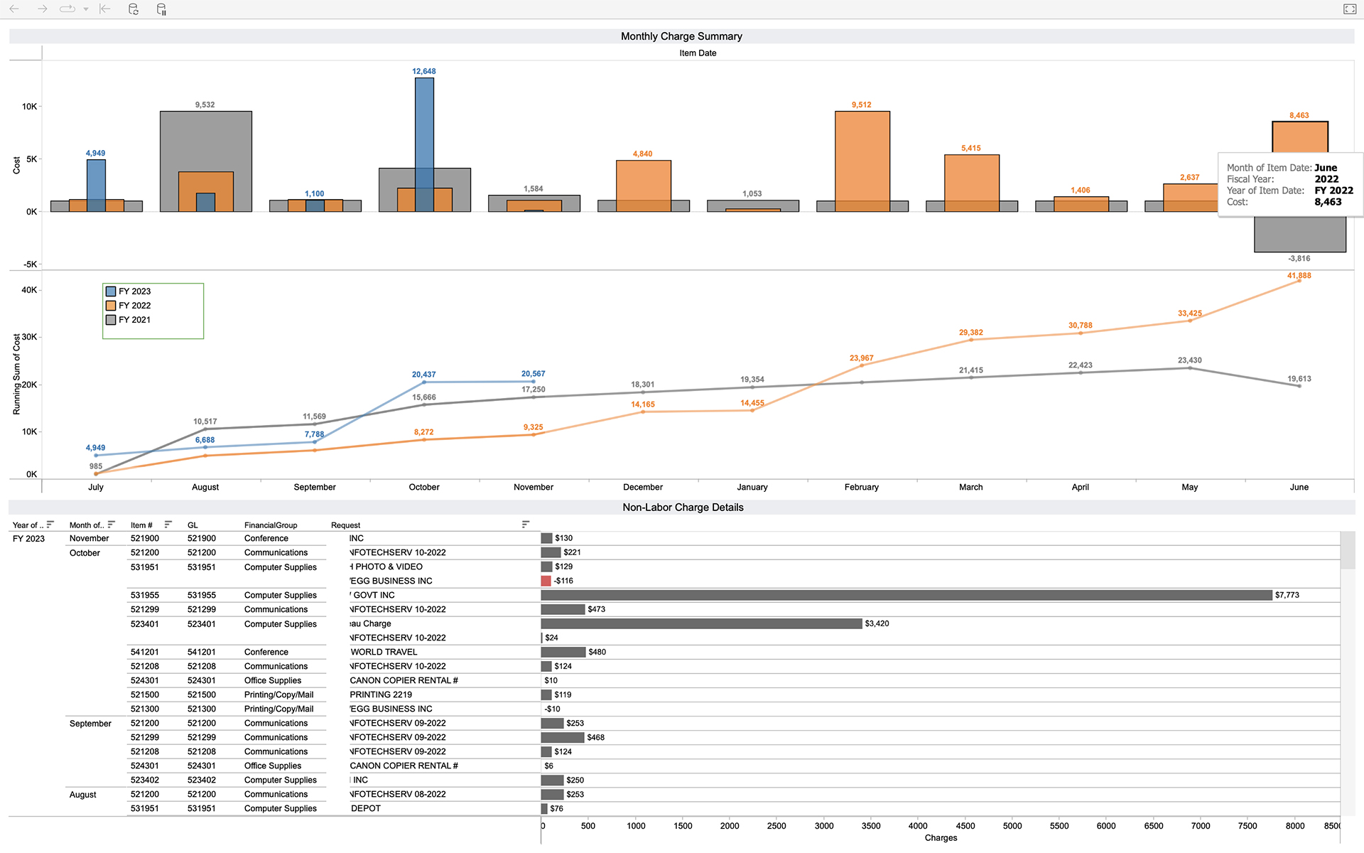
Audience: This particular dashboard was designed for directors/managers responsible for financial expenditures but can have a wide-ranging audience depending on design.
Data Requirements: Individual transaction data including cost, description, transaction date, and financial coding. Additional integrations should include budget information.
Productivity
Productivity has wide-ranging definitions, but most organizations must predict annual labor hours and staffing. Being able to show actual progress throughout the year can help identify how well an organization is meeting its goals and potentially avert any end-of-year surprises. The objective of the following visualization is to show a department’s productivity variance from budget. The percent variance or percentage of the difference between budget and actual provides a quick glance of magnitude of how far away one is from the budget.
The primary KPI (key performance indicator) represented by the number in the green circle is the overall aggregated average of all staff included with the search filters. The vertical bar chart shows the same percent variance by employee category. The diverging bar chart on the bottom identifies individual staff variance. The dashboard filters enable the analysis on various supervisors or any specific trade down to selected individuals. The data can be explored further using tooltips or selections of the diverging bars.
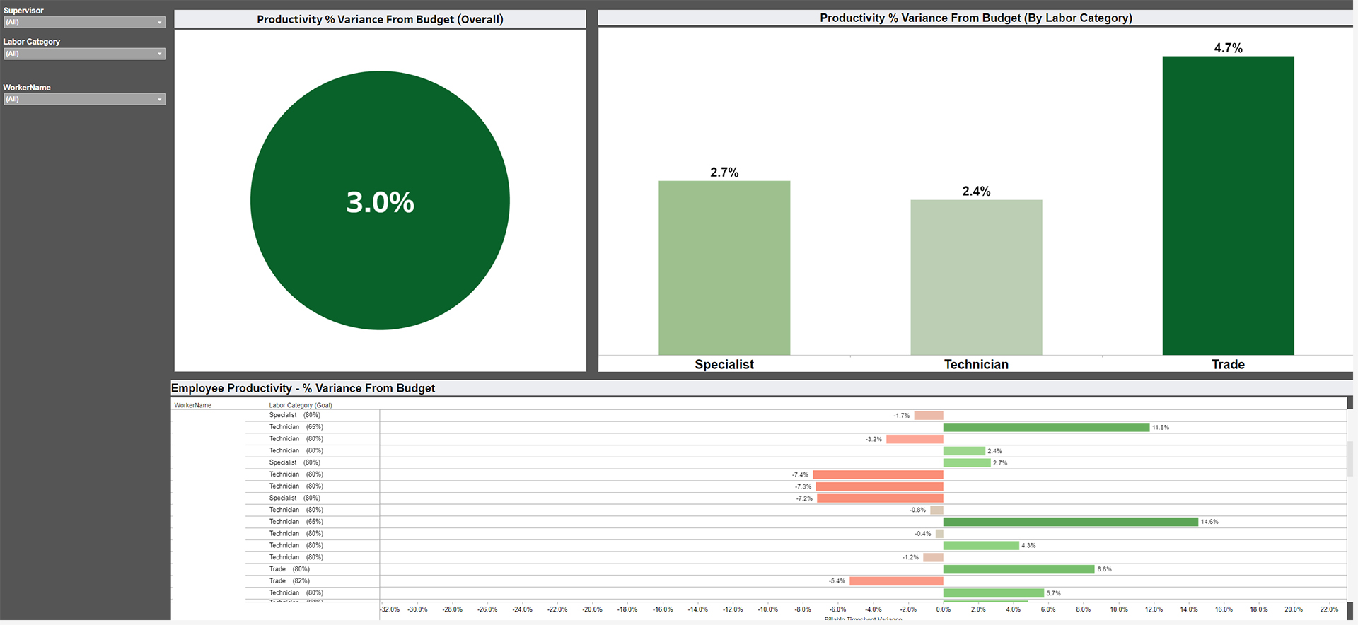
The productivity dashboard went through several iterations beginning with a tabular report delivered to supervisors with data for each of their direct reports. Eventually it transformed into a KPI value dashboard using the same data. Additional improvements could add the visualization of the change in KPI value over time.
Audience: The target audience can range from directors to supervisors.
Data Requirements: To display a variance, one must start with a target and have actual data to compare. In this case, the variance was connected to the department timesheet data to identify the number of hours worked and hours of leave used.
Staffing
Graphical representations of data allow the viewer to easily see trends and help identify when to pivot. The following dashboard depicts the monthly staffing levels over multiple years for multiple departments. The visualization can identify the impact on departments when various new initiatives are rolled out. One use case for this dashboard is to help identify the effects on staffing with a change in minimum wage. Did we lose positions when the city raised base pay to $22 per hour? This kind of visualization helps differentiate assumptions from reality. Additional aspects that can be added are staffing-per-square-feet to add more dimension to the data.
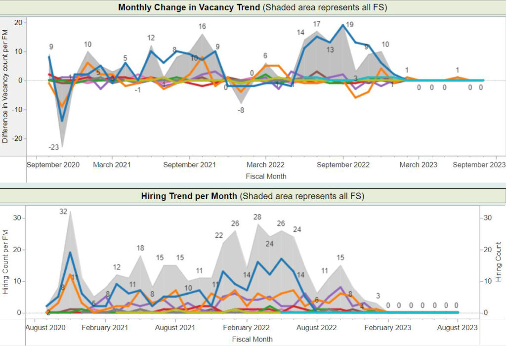
Audience: The primary target audience for this staffing dashboard is management.
Data Requirements: Payroll and/or staffing data.
Building Costs
Which building uses the highest labor hours? Which building has the highest maintenance cost? These are common questions that need to be answered. This information is important to planning future expansion and labor needs, but this data is critical to supervisors when they are planning routes and staffing requirements for their departments. The following dashboard shows work order costs and counts-per-building as well as historical trends with several filtering capabilities.
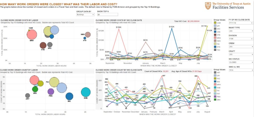
Audience: Supervisors and management.
Data Requirements: IWMS/CMMS building cost data.
Another similar take on building costs is ranking buildings on the various costs. The example below has been nicknamed the “Hot Building List.” The request started out with the question, “Where should my focus be this week?” Now the visualization is much more valuable than that, as it can be used to assist in making numerous decisions. It breaks down the top ten building costs per square foot, total costs, and work order counts from the perspective of planned and unplanned maintenance or both. It also allows the user to select how many days to analyze and provides the ability to select a building.
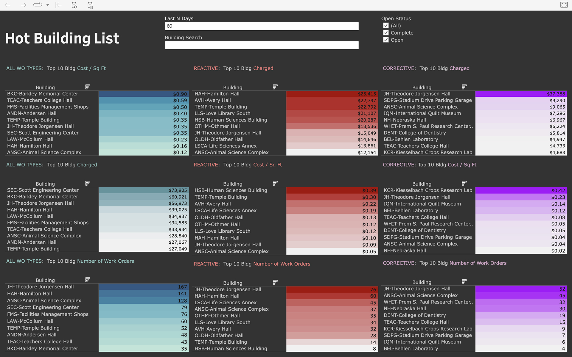
Audience: Management/directors.
Data Requirements: IWMS/CMMS building cost and work order data.
There are several factors that will determine the success of a data visualization and certain key questions to consider as you start the process.
- Who is the target audience for the visualization? Knowing who is consuming the data helps determine if the visualization should include a high-level KPI or require significant drill-down capabilities.
- What information am I trying to share, and is it clear to the user? Identifying the purpose of the dashboard or truly defining the desired outcome of the dashboard is critical. It is helpful to the creator and the user to include on the dashboard such information as what the source data is and how often it gets refreshed. It is also helpful to include instructions on how a user can interact with the dashboard.
- Where do I get all the information needed to create the dashboard? Visualization software, like Tableau, makes connecting various sources of data much simpler these days, but the data must be consistently retrievable and reliable.
These questions don’t account for everything but will guide you down the path to a successful data visualization.
Conclusion
The journey to becoming a data-driven organization is filled with challenges. Any informatics or analytics team out there will have stories of both success and failure. The data visualizations shared may not work for everyone but can bring to light some ideas that will work for your organization. It is rare that any one visualization can tell you everything about the data, but it can trigger one to ask those deeper questions about that data.
If the data culture in one’s institution is still in its infancy, start simple. As the maturity of the data culture grows, the visualizations can become more complex. Decisions are made at every level every day. The more we can support those decisions with data only increases the operational value we achieve.
Jake Olson is senior manager of informatics at the University of Nebraska Lincoln; he can be reached at [email protected]. Markus Hogue is geospatial information and drones analyst at the University of Texas Austin; he can be reached at [email protected].


